Presenting three fascinating hotel sitting areas, with a distinct design character and a strong personality.
4 mins readSponsored
In this dedicated Hotel Design collection, Hotelier Academy presents various interesting concepts about a popular hotel section: the hotel sitting areas. These common spaces are meant for lounging, socialising, chatting or even enjoying a cup of coffee.
But why are hotel common sitting areas so important?
Hotel sitting areas are considered integral parts of a Hotel. For this reason, hoteliers and their designers, must put themselves in the travellers’ shoes and deliver comfortable and relaxing spots. Moreover, these spaces can be a socially shareable experience for the travellers, so it is vital that they represent the hotel’s general philosophy and aesthetics.
Below, you can find a selection of interesting hotel sitting areas from different Hotels, each one showcasing a unique example of the above-mentioned guidelines. These three examples have caught our attention, and we are confident that they will give you exceptional ideas for your hotel’s sitting area’s design — and not only!
An impressive approach makes a statement!
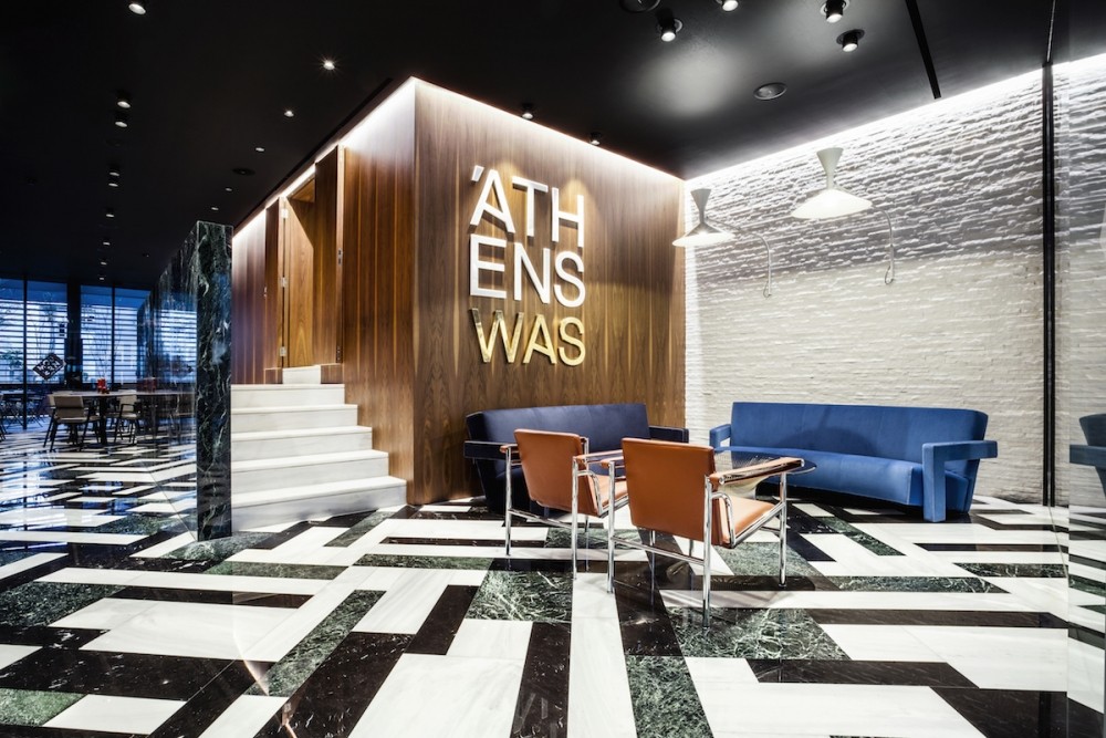
Athens Was Hotel, Athens, Greece
Fancy Clue: The impressive Hotel Logo on the wall, can easily become the background for the hotel guests’ ‘selfie’ pictures. This will give extra publicity to the property within its guests’ friends!
What to say about this exceptional spot! First of all, the floor speaks loudly and catches everybody’s attention, since it is impossible to miss it. The black-white-green pattern of the floor works really well with the wooden wall surfaces and the white brick wall. Athens Was Hotel definitely makes a statement by combining all these elements together. Yet, somehow, it manages to create a balanced environment, with so many ‘noisy’ elements working together in harmony. On top of that, the blue couch emerges from its wooden background, breaking the old-fashioned perception of never combining green with blue! The secret to this successful ‘marriage’ is the tones of both colours. Due to their deep colour grading and vibrant saturation, they create a pleasing contrast on the edge of becoming loud, though without crossing the line.
Sponsored
White, White, White. And a pinch of Black.
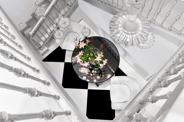
Sant Pere Del Bosc Hotel & Spa, Hotel Costa Brava, Spain
Fancy Clue: Using black and white colors is probably the safest way to go. They create a well-received combination that satisfies the majority of the hotel guests, ensuring a positive feedback for the hotel’s overall design!
Here’s an area that combines two design influences: white colour and classic details. This blend creates a unique personality for Sant Pere Del Bosc Hotel & Spa‘s sitting area. Let’s begin with the use of colours. White is not only a colour that subconsciously relaxes the mind, but it also emits luxury and high-end vibes. At the same time, black comes to create a bit of contrast, yet in an amount that doesn’t steal the glory of the white surfaces. Black is used on square shapes on the floor as well as on the dominating table of this hotel sitting area. Flowers come to add a touch of colour to the whole synthesis. Style-wise, classic vibes are highlighted with the furniture and chandelier choices. At the same time, the checkered flooring enhances the area giving a playful hint.
A piece of furniture that catches everyone’s attention!
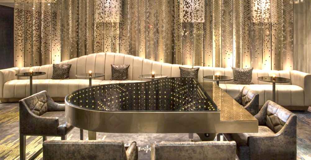
W New York – Times Square, New York City, United States
Fancy Clue: Special furniture always catches the hotel guests’ attention. It is most likely that during their stay, the guests will share such a unique piece of furniture through their social media!
A great sitting area example, where the whole room has a fine design approach. Yet, a single piece of furniture steals the attention. The statement element of W New York – Times Square Hotel‘s sitting area is the piano. The musical instrument has a different use here, working as a table in an unexpected way. When designing a room, it is always fun to use everyday things, differently. So, the moment travellers meet something like this in your property’s sitting area, they will definitely spend some time observing its details, in a curious and exciting mood. This happens because people’s minds are triggered by something being ‘misplaced’ or ‘misused’. However, the beautiful and inspirational way in which this occurs manages to win their enthusiasm!

