Discover the design details of The Mansion Boutique Hotel's amazing Hotel Lobby, that almost feels like a Patio!
3 mins readThe Backstory
In this article, we will study the stunning lobby of The Mansion Boutique Hotel in Bucharest, which combines vintage and modern styles, as well as a lot of history! The building that today is The Mansion, was home to a well-known architect in the years 1850-1870, Alexander Protopopescu. Protopopescu was close friends with the royal house and rumour had it that even King Carol I came to visit his architect friend, discreetly participating at a few balls and parties organized here. During the next years, the small hotel accommodated treasurers of the Belgian Royal House, ruled at the time by Leopold I, and the family members of Prince Florestan of Monaco.
It almost feels like a patio!
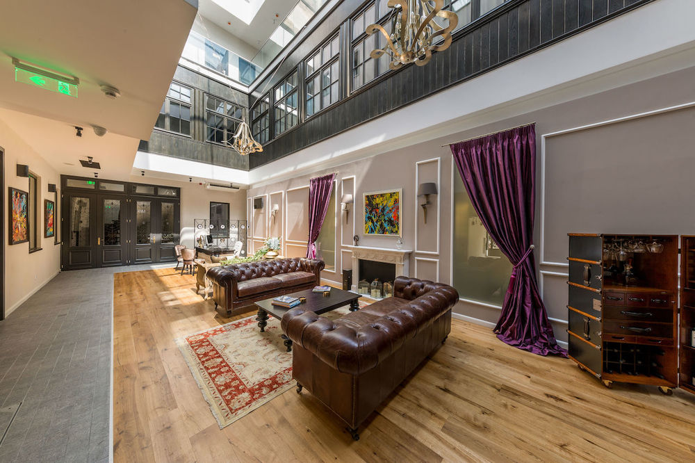
Moving to the details of this Hotel Lobby, one could say that thanks to its glass roof, it is almost an indoor patio, where guests can lounge around and enjoy the sun! Another eye-catching factor is the very shape of the lobby. Its elongated rectangular shape develops a unique space that, in combination with a well-thought selection of furniture, creates a character that suits the story of the hotel. The rooms develop all around the lobby and the travellers can see it through every corner of the corridors.
Like coming home
Once the hotel’s guests enter the building, they come across the cosiest part of the lobby. This space is set like a living room, making travellers feel like home. The two leather sofas, in 80’s style, in combination with the wooden coffee table and the vintage rug, reminiscent of the building’s past times. To modernize the setting, the flooring combines wood and tiles, in neutral — yet trending — colour tones, creating a more minimal base for the furniture. The fireplace, though not real, is decorated with candles, and adds a cosy vibe to the lounge area. Finally, the dramatic curtains define the space, separating it from the rest of the environment.
Colors are essential
As for the colours, it is clear that The Mansion wishes to have a contemporary approach while having royal hints. And the colour choices clearly highlight these hints: The luxurious deep purple of the curtains gives a classy tone, while the brown leather sofas contribute greatly to the overall fine design.
To spice things up, a piece of art above the fireplace has a more playful character, breaking the ‘seriousness’ of the spot in order to create a pleasing mix & match of styles.
Finally, the green plants placed on the table behind one of the sofas, bring out a touch of nature.
The drinker’s corner
The lobby’s most interesting detail is the mini bar, that combines the idea of a vintage suitcase and a safety box! This unique piece draws the attention due to its size, style and the excellent idea of The Mansion Hotel people, who decided to make it a drinks’ source.
The reception area
What we like most is that the hotel design has maintained the building’s original ambiance. The designers made sure not to alter its character or create new spaces, and took advantage of its unexpected shape. Within this context, the reception area has been designed in a neoclassical style, dominated by a beautiful table that reminds of a regular office. A third sofa determines the area of the front office, separating the ‘waiting room’ from the lounge area.


